

Duolingo
Designing a chat feature to increase learner motivation and retention
Overview
My Role
This was a collaborative product design exploration with 2 other designers focused on introducing a new feature into Duolingo’s existing ecosystem. I contributed to user interviews, workflow design, and ensuring the feature integrated seamlessly within the established product.
Role: Designer, Researcher
Tasks: Designing, Wireframing, Prototyping
Time Frame: 2 Week Sprint
Tools: Figma, Trello, MockUp
Platforms: Mobile
Research & Insights
Goals: To understand how and why users learn.
User Interview Approach
I interviewed users of Duolingo and other educational apps (Khan Academy, Coursera, etc.). During the conversations, I focused on what users enjoyed, why they kept coming back, and why they were learning in the first place.
User Interview Feedback
Users need a way to share what they have learned
Users enjoy learning with others
Users enjoy being motivated by the app
Takeaway: Users enjoy social learning and want motivation from peers.
Design Exploration
Design Studio
I led a design studio to generate ideas centered around users communicating, collaborating, and competing. Then, I guided the group in refining the features we came up with with features that align with Duolingo’s brand.


Wireframes & Flow
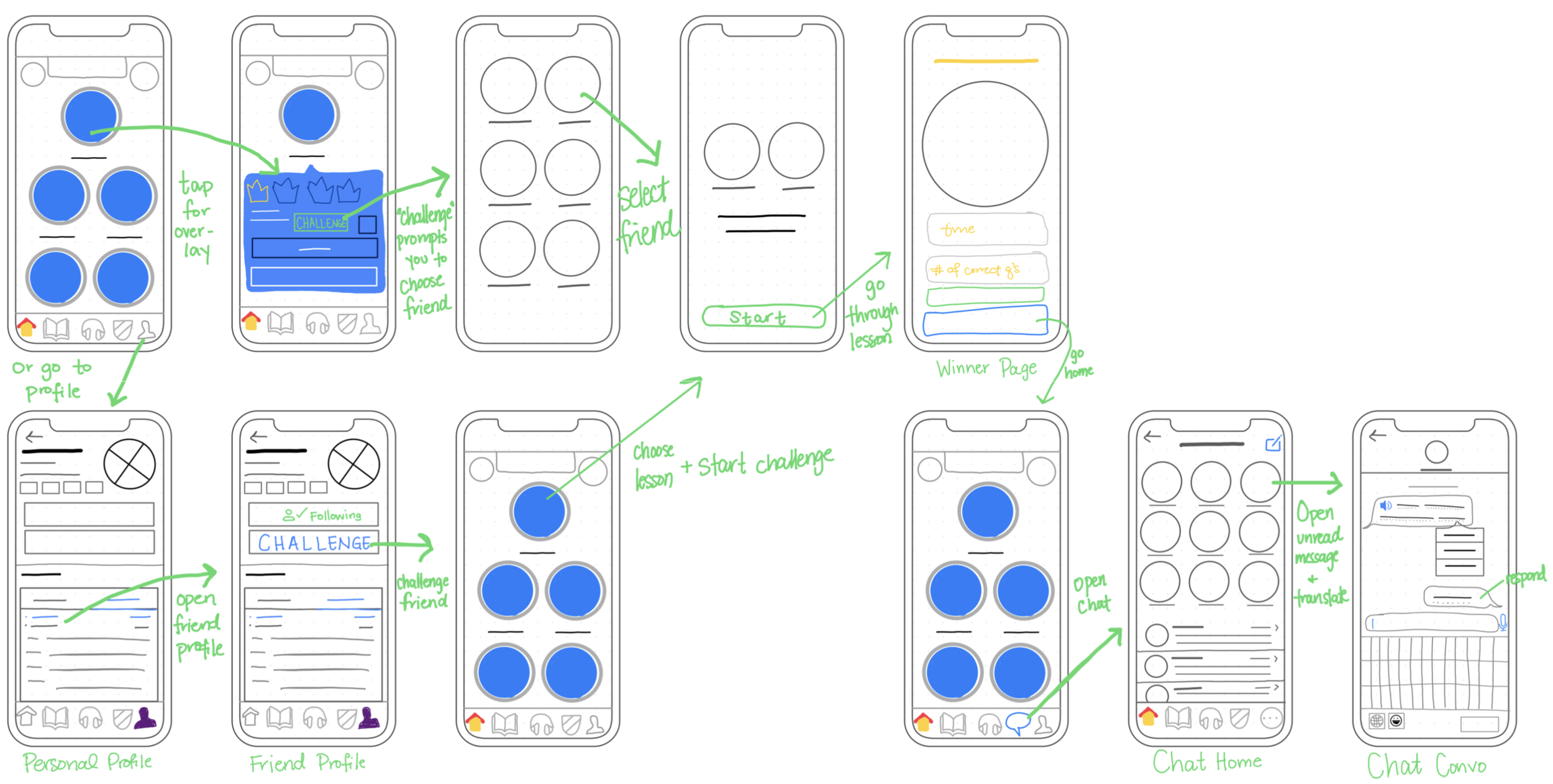
Building on our design studio concepts, I translated the selected features into detailed wireframes and end-to-end workflows, ensuring the new social features integrated seamlessly within Duolingo’s existing learning architecture. My focus was to introduce peer-to-peer interaction without disrupting the core study experience or increasing cognitive load.
I designed the following key touchpoints:
Introducing a “Challenge” CTA within the skill card overlay, allowing users to initiate timed, accuracy-based competitions directly from their learning path
Adding a Challenge entry point within the Friends section, reinforcing social discovery and peer engagement
Updating the navigation structure to accommodate the Messaging feature while preserving clarity and minimizing cognitive load
Designing a dedicated Messaging/ Chat experience, aligned with Duolingo’s visual system and interaction patterns
Each of these features was designed to maintain access to core language-learning functionality, prevent social features from overshadowing primary goals, and preserve the simplicity of navigation structure.

To validate flow clarity, I mapped end-to-end user journeys for initiating, completing, and reviewing a challenge. This ensured the feature felt additive rather than disruptive and that transitions between learning and social engagement were intuitive.
Design Integration
UI Alignment

Rather than introducing new visual language, I leveraged familiar UI structures to reduce cognitive friction and preserve product cohesion.
New elements — such as challenge states and messaging indicators — were designed as scalable components that could integrate into the broader system without disrupting visual hierarchy or navigation clarity.

Interactive Prototype
To evaluate interaction clarity and workflow transitions, I developed a fully interactive high-fidelity prototype simulating the challenge and messaging experience.
Feel free to explore the prototype below to experience the end-to-end flow.
Iteration & Validation
We conducted moderated usability tests to evaluate the clarity of challenge initiation, navigation discoverability, and messaging comprehension. Testing revealed friction around notifications in chat and mobile features.
Usability Testing

Users didn’t realize that they were being evaluated on their time during the challenge, so we implemented a timer that showed throughout.
Hover vs Focus State
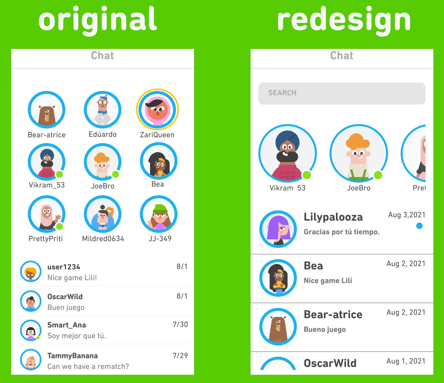
The chat mimicked iMessage, which was confusing for Android users, and it was unclear which message was unread. I created a redesign similar to Facebook Messenger or WhatsApp, which is more widely used.
Implementing a Timer

Chat Updates
Originally, we designed the translate feature to have hover capabilities. Hover isn’t possible on mobile, so I changed it to be clickable.
Reflection
Although the usability feedback surfaced relatively small adjustments — such as clarifying notification visibility within chat, improving timer prominence during challenges, and refining hover versus focus states — these refinements reinforced how impactful micro-interactions are within a mature product ecosystem. In high-frequency environments like Duolingo, even subtle inconsistencies can create friction or hesitation.
This project strengthened my ability to design within an existing system rather than around it. Extending established UI patterns required intentional restraint — prioritizing cohesion, accessibility, and clarity over introducing novelty. Collaborating with other designers also emphasized the importance of alignment and critique in evolving a feature from concept to a more product-ready state.
If developed further, the next phase would focus on expanded testing and measurable engagement outcomes to validate long-term impact.